
26.05.20236 mins read
One of our design goals at All human is accessibility. We want to create and build digital experiences that everyone can use. Our recent win for Best in Universal Design at the 2023 Spiders demonstrates that we are accomplishing this. The award was for our collaboration with Fáilte Ireland and the creation, design, and development of the new Visit Dublin site.
In Making the web accessible and addressing common errors, my colleague Zonja St.Clair talks in greater detail about what is meant by the governing bodies overseeing accessibility guidelines and some of the common mistakes regularly seen on websites.
Because so many sites were not inclusive, in 2019, the European Accessibility Act was introduced, laying down some rules aiming to provide people with disabilities better access to websites and mobile apps of public services. And many of these rules will now also apply to private sites and apps. By June 2025, companies must ensure that newly marketed products and sedatives covered by the Act are accessible.
To meet this requirement, these organisations had to begin the process of having their sites and apps assessed to ensure they complied with the legislation.
In Ireland, the National Disability Authority (NDA) is the national monitoring body for accessibility issues. In August 2021, they selected Deque's axe Monitor to test accessibility for websites and other HTML-based user interfaces. The axe Monitor automatically scans web content and identifies violations of accessibility compliance.
Each site is provided with an accessibility score based on the number of pages containing critical, serious, moderate, minor, or zero issues. Issues that arise are grouped against the success criteria of the WCAG 2.1 guidelines, including:
- ARIA
- colour
- forms
- keyboard
- language
- name/role/value
- tables
- alternatives text
- media
When designing visitdublin.com, we wanted to make sure that everyone could avail of all the invaluable information it offers for anyone planning a stay in Dublin. To facilitate this, we incorporated the 7 Principles of Universal Design into every step of the customer journey.
These principles or guidelines provide a framework for designing products, environments, and systems that are usable by all people, regardless of their age, ability, or background.
They are:
- Equity.
- Flexibility in use.
- Simple and intuitive use.
- Perceptible information.
- Tolerance for error.
- Low physical effort.
- Size and space for approach and use.
By incorporating these principles into our website design process, we were able to design VisitDublin to be accessible and usable for everyone, including people with disabilities.
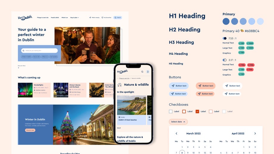
An example of these principles in practice is that the website has clear navigation, easy-to-read text, and keyboard navigation for those with physical impairments. It was designed to be compatible with various devices, operating systems, and browsers, ensuring all users can access the content regardless of their technical abilities or technology.
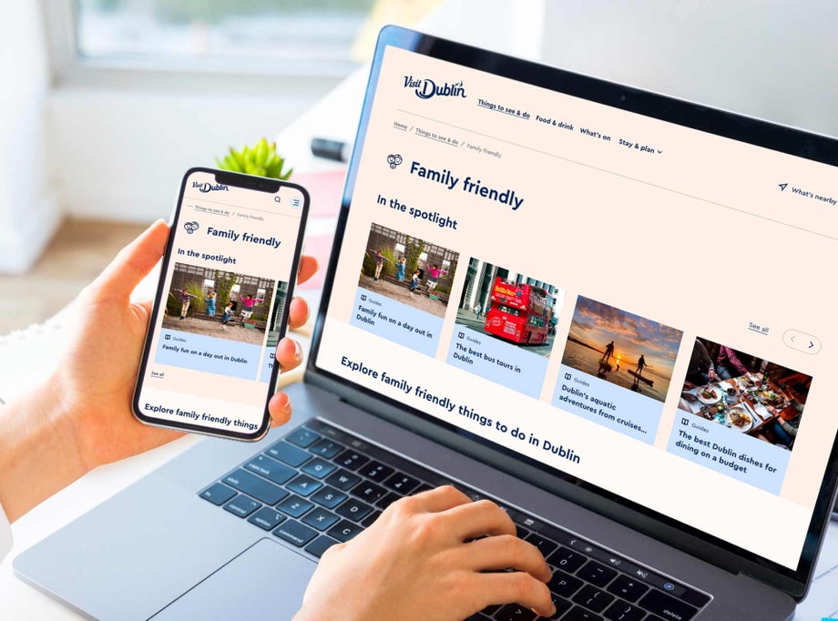
We utilised a 4-point grid system to design the website from scratch. This system helps to create a consistent and structured layout, which is easier for users to navigate. Furthermore, it enabled a responsive design that seamlessly adapts to different screen sizes by enabling fluid layout modifications.
Providing a great user experience (UX) is especially important for those using accessibility tools. For example, we implemented a ‘Skip the list’ link to enable those using keyboard navigation to skip viewing all elements in a carousel. This allows a user to view the website like someone navigating with a mouse.
When working with established brands such as VisitDublin, reviewing the brand colour palette is integral to our design process. Our goal is to select colours that look visually appealing and promote accessibility. To achieve this, we carefully analyse the colour combinations used on the user interface, ensuring that they adhere to the WCAG AA standard and prioritise good contrast across the website. Our design choices are informed by the AA standard from the WCAG guidelines, which we implement throughout the site to ensure that it meets accessibility best practices.
We also focused on specific groups of people who may require special assistance when visiting Dublin. This included analysing the needs of individuals with different languages or accessibility requirements and identifying design solutions that could enhance their overall experience. As a result, we added a Stay and Plan section to VisitDublin, which features essential traveller information such as accessibility tips for navigating the city, locations of tourism offices, and emergency numbers. By providing this information online, we aimed to make the offline experience easier for visitors who require special assistance.
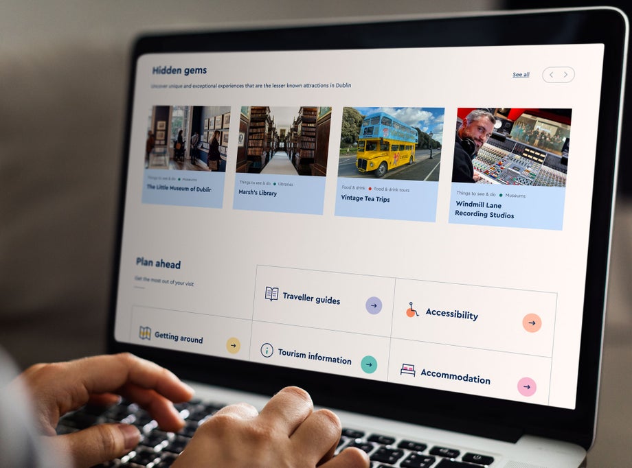
Our design approach is centred around simplicity and familiarity, taking into account user habits and preferences. We use language and symbols that are immediately recognizable, allowing users to become accustomed to features without having to relearn them each time they access a new page. One such example is our universal search feature, which is easily accessible from anywhere on the website. This provides users a quick and efficient way to find and discover content using simple parameters, creating a more inclusive customer experience (CX) for all users. The feature also enables users to quickly refine their searches by specifying terms or keywords associated with their query, enhancing the search experience.
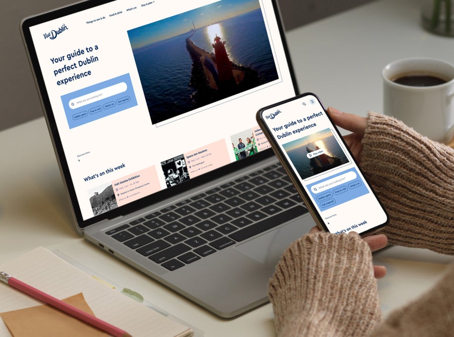
In addition to providing quick and efficient search results, we ensure that the results are presented in an accessible and easy-to-understand format. We aim to make it as simple as possible for users to quickly find what they are looking for, narrow down search results, or reset filters. The search feature is designed with an intuitive and user-friendly layout, making it easy for users to navigate and find relevant content.
We take a proactive approach to designing for accessibility, recognising that it is an ongoing effort that requires constant review and improvement. We challenge our design decisions regularly and test new hypotheses based on user activity on the website. Our ultimate goal is to understand user behaviour and cater to scenarios that may have yet to be initially considered. With a solid design system as the foundation for VisitDublin, we can easily make necessary changes along the way to improve accessibility and user experience (UX). We are committed to continually reviewing and enhancing our website to ensure it remains accessible and inclusive for all users.

Learn how we delivered a single centralised customer experience with Discover Ireland
