
29.09.202211 mins read
What do we mean when we talk about web accessibility? According to the World Wide Web Consortium (W3C), it is about ensuring that people with disabilities can perceive, understand, navigate, and interact with the web and that they can contribute to the web.
Web accessibility also benefits others, including older people with changing abilities due to ageing, or people with temporary disabilities such as a broken arm or lost glasses.
One of the most pervasive misconceptions about accessibility is that it only affects a small number of people. Another one that is quite popular is it’s just about helping the visually impaired.
The truth, as usual, is quite a bit different.
- The World Bank estimates that 15% of the earth's population experience some form of disability. That’s over 1 billion people worldwide.
- The number of people with disabilities is dramatically increasing due to health factors and chronic health conditions.
- Almost everyone is likely to experience some form of disability – temporary or permanent – at some point in life.
- Approximately 8% of men and 0.5% of women are colour blind
- 10% of the Irish population are dyslexic
- Over 1.5 billion people globally live with hearing loss.

The W3C is the main association working towards establishing an international framework. They produce the Web Content Accessibility Guidelines (WCAG), which are now in their third iteration. They also run the Web Accessibility Initiative (WIP) to develop standards and support materials to help organisations understand and implement accessibility.
Apart from the fact that it is the right thing that the web is accessible for all, there is the issue of compliance. The European Union (Accessibility of Websites and Mobile Applications of Public Sector Bodies) Regulations 2020, which came into effect in September 2020, decrees that all public sector bodies must ensure that their websites and mobile apps are accessible to all people. In Ireland, the National Disability Authority monitors public sector websites and works with organisations to review and check for compliance with regulatory requirements.
While this law only covers public-state bodies, which is a common practice worldwide, the requirement for all online services to be accessible for all is an expectation for modern web users. Also, regardless of whether you are a private body and therefore not subject to the EU ruling doesn’t mean you will avoid a lawsuit. In fact, over the last decade, many lawsuits have been filed by individuals with disabilities claiming that businesses' websites are not accessible to them.
In 2020 Bruce Maguire, blind since birth, brought a case against the Sydney Organising Committee for the Olympic Games (SOCOG) to the Human Rights and Equal Opportunities Commission(HREOC). The HREOC found in his favour and as a result, the Australian government adopted W3C Guidelines, the Commonwealth Government required all agency websites to pass accessibility tests by the end of 2020 and the SOCOG has to pay Bruce damages of 20,000 AUD.

The WC3 has developed the standards that if followed will help ensure that websites are open to all. WCAG 3.0 is the latest working draft of the guidelines which are grouped under 4 main principles: Perceivable, Operable, Understandable and Robust.
Visitors must be able to understand the content and information that’s presented on your website. Perceivable doesn’t necessarily mean “see with one’s eyes” — users who are blind or have low vision often use screen reader software, which converts printed text into synthesised speech or braille characters.
Perceivable Guidelines:
- Make it simpler for users to see and hear content
- Present text alternatives for non-text content
- Give captions and other alternatives for multimedia
- Create content that can be presented without losing meaning using assistive technologies.
Operable websites ensure that components and navigation are accessible - from navigating to a page, to opening a link, playing audio, or pausing a video and available to all.
Operable websites are generally straightforward with a limit on excess functionality that could impede users with disabilities.
Operable Guidelines:
- Make all functionality accessible straight from a keyboard
- Give users sufficient time to read and use the content
- Don’t use content that might trigger seizures
- Facilitate users to navigate and find content.
All content on your website should be easily understood. This is particularly important for those with cognitive disabilities, and those who do not speak the primary language used on your site. This principle also applies to the structure of your content - ensuring navigation is consistent, headings are marked up with heading tags, and that content is presented in a semantic structure.
Understandable Guidelines:
- Build text that is understandable and readable.
- Create content appear and operate in predictable manners.
- Help users avoid and correct errors.
All content and functionality on your website can be interpreted by all users, regardless of assistive technologies and screen readers. This also means that content must remain accessible as technologies advance and evolve.
Robust Guideline:
- Maximise compatibility with present and future user tools.
There are a total of 78 guidelines to follow if you want to reach the highest level of accessibility.
As you start on this journey, there are several areas that can be addressed for quick wins.
Here are the top 5 mistakes that we see repeatedly:
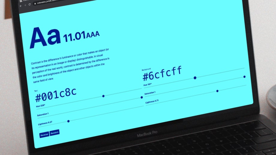
Low contrast text is probably the most common accessibility issue across all the websites we review. According to WebAIM’s most recent analysis, 83.9% of the websites analysed did not have sufficient colour contrast on their home pages. Low contrast on text makes it incredibly hard for users with low visibility or those with various types of colour blindness to read or decipher your text.
Solution: To ensure accessibility the text-to-background contrast ratio must be 4.5:1. You can test the contrast of your text with tools such as Webaim’s Contrast Checker. We’d recommend doing this at the design stage to prevent having to address these issues at the development stage.
Missing or incorrect alt text is one of the most common accessibility issues in web design. According to WebAIM, 23.2% of home page images were missing alternative text.
Solution: Remember to always add a descriptive text alternative to any image that is not decorative, such as photos, banners, illustrations, and graphs.
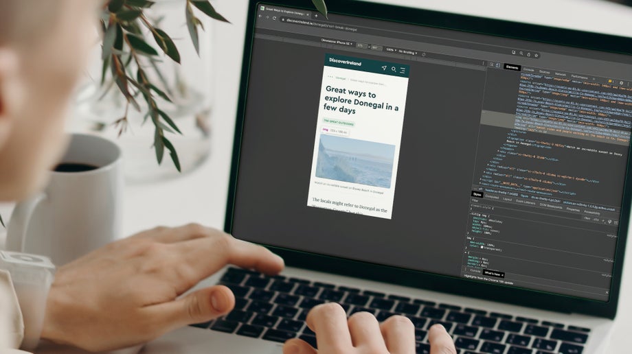
Heading tags markup and arrange the content on your page in a logical format from the most important heading on the page <h1> to those of lesser importance <h6>.
People using assistive technologies, such as screenreaders, rarely read through all the content on your page, and use the heading structure to skip to the content they require. Semantic markup of headings is crucial to ensure visitors have no difficulties navigating your site.
Solution: Use heading tags in a logical order and descriptive headings to help users with assistive technology navigate straight to the content they need.
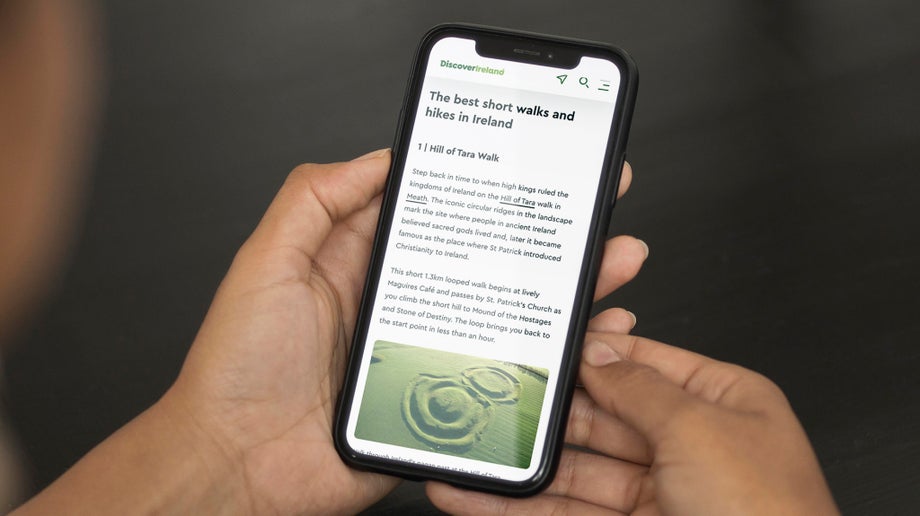
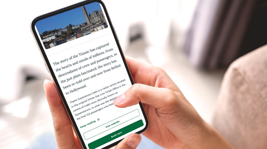
When creating links to any content on your website, it is important to use the link text to describe where the link will go. As with headings, some users will skip through content only reading the links on the page. If the text on your link is ‘Read more’, ‘More info’ or ‘View more’ and a user is just skipping through link text, these descriptions make no sense out of context.
Solution: When creating your links, use descriptive and unique text that explains where the link will take you
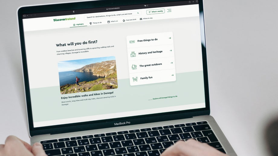
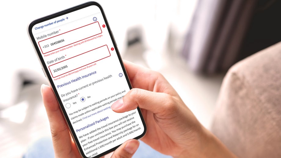
When form inputs are missing descriptive form labels, it can make it very difficult for users using assistive technologies to know the content they are being asked for. If no label is present, or the label is not descriptive enough, the user has no idea what information is required.
Solutions: Every field in the form should have an accurately positioned, descriptive label. Use the <label> tag to associate the label text with the form field. If a form field is asking for your name, the label associated with it should be ‘name’, similarly, if you are asking for an email add a label ‘email address’ or ‘your email’ should be present.
Our team is always geeking out on new tools, software, and resources to help us continue to improve and stay informed about the latest accessible technology for assisting web users with disabilities.
Here are a few that we’re currently swooning over:
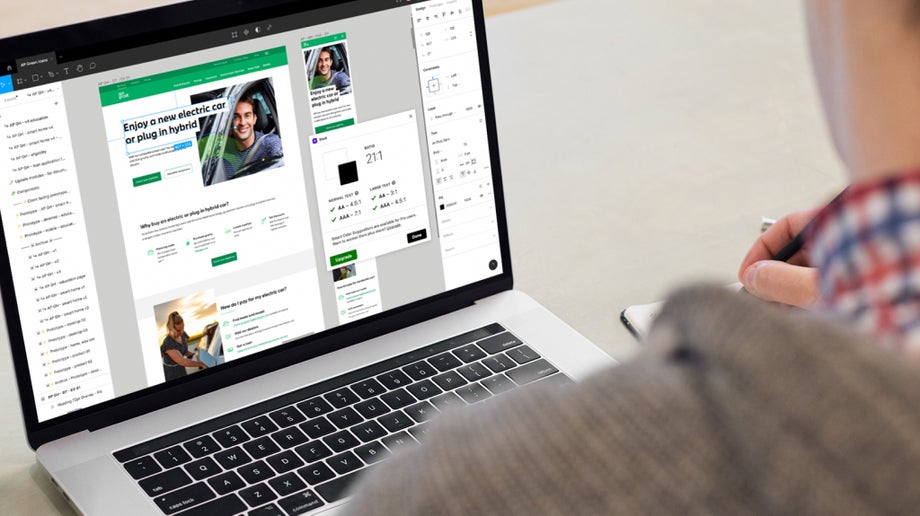
At All human, we use Figma as our main design tool, and along with upskilling on the ever-evolving Figma tools, we have embraced some of the accessibility plugins. The Stark Suite plugin is a combination of integrated tools that help you streamline your accessibility workflow at the design phase.
Tools like contrast checkers, focus order, alt-text annotations, touch targets, and vision simulators allow us to quickly analyse our designs and benchmark them against accessibility guidelines before going on to development.
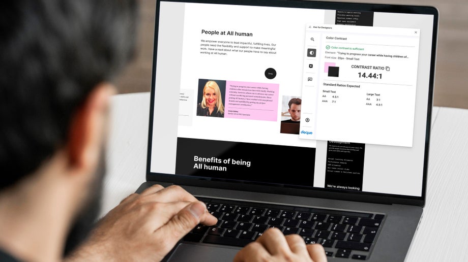
Axe and the deque solutions have long been essential accessibility tools for web developers. This new Figma plugin allows designers to scan designs to ensure colour-contrast, touch target and heading structure all meet the required guidelines for accessibility.
Creating a dark mode for your visitors has become an emerging trend in interface design, often considered better for your eyes or better to use in the evenings, but is it really more accessible for people with visual impairments? This great article debunks the myth that dark mode is more accessible than regular dark text on a white background.
The Accessibility not-checklist is a fun resource of what needs to be considered to build accessible and inclusive online experiences. You need to be already familiar with the guidelines, but it's a handy tool to check off all the considerations you need to make, and who’s responsible for it within your team. A great resource for teams!
One of the challenges of data visualisation is to make your data accessible. The information can often be challenging for people with visual impairments, particularly for those who do not use assistive technology like screen readers.
Kent Eisenhuth’s and Kai Chang’s case study explores how an accessibility-first approach led them to a better visual design. They highlight how they used WCAG in their chart design process. This approach ensures that accessibility is a core to the chart’s visual design without sacrificing readability, making them accessible for all.
Denis Kryukov also has a great article on the strategies and best practices on how to make your charts more accessible.
Many older adults struggle with loneliness and isolation. Though being socially connected is vital for their health and wellbeing, often they don’t know how to use the technology that can help them. That’s why the NCOA recently published a piece about supporting senior communication. In this piece, readers will find:
- How to provide accessible communication for folks with vision, hearing or mobility challenges
- One of the most comprehensive lists of applications and technologies available to help people stay connected to friends and family
- Practical tips to stay social and enjoy the fine arts
Plus, they provide actionable ideas from a licensed therapist that readers can use to ensure they or their loved ones can successfully cope with anxiety.
Here at All human, accessibility is at the core of everything we design and build. All of our designers and developers are trained in how to build accessible digital products and services. We also have experience in auditing and enhancing existing websites to adhere to accessibility standards. To redress accessibility issues on several websites we have put together a team of digital experts and have developed an efficient process for ensuring and maintaining website accessibility.
This team is comprised of a:
- User interface(UI) designer
- Front end engineer
- Back end developer
- Quality Assurance (QA) analyst
- Project manager.
We also work closely with the NDA to ensure we are using the latest tools and technologies to monitor accessibility. Deque's axe Monitor is the tool recommended by the NDA for testing the accessibility of websites. The axe Monitor automatically scans web content and identifies violations of accessibility compliance - and gives the site an accessibility score.
Two recent accessibility projects used this tool to pinpoint issues and address them. On one site we increased the accessibility score from 42% to 89%. The other site saw its score dramatically improve from 7% to 92%.
If you have any questions about accessible web design or evaluating the level of accessibility of your website, please get in touch.
